Learning the Basics of Data Analysis Using IPL Data (Part-III)
Statistical and descriptive analysis of the attributes in the IPL deliveries dataset, preparing for data engineering and machine learning.


Hello again! In the final part of this series on basic exploratory analysis of the IPL dataset, we would try to visually plot the data and see if we could make some strong inferences. Also make sure that you have read the previous blog before we move ahead.
So, now that we have a smaller and possibly more useful dataset, let us plot some of the attributes onto graphs and see if we can find some visual correlations. We would be using Matplotlib for this job, which is a comprehensive plotting library for creating static, animated, and interactive visualizations in Python, and is one of the favourite tools of every data analyst.
As a tip, always try plotting the data onto some charts or graphs to get a more intuitive understanding of it. Humans in general are better at detecting patterns from visual cues rather than a bunch of random numbers.
Run this beforehand if you are using Jupyter, this simple commands tells the notebook to keep all the output images in the notebook itself and not pop them out externally.
%matplotlib inline
Let us start with creating a scatter plot using plt.scatter() for all the scores versus the wickets in each innings, and see if we can notice something. We would also add some labels to make the output image more understandable.
import matplotlib.pyplot as plt

fig, ax = plt.subplots(figsize=(10,5))

x = match_data['total_runs']
y = match_data['wickets']
plt.scatter(x, y)

fig.suptitle('Scatter Plot of Runs vs Wickets',fontsize=20)
plt.xlabel('Runs', fontsize=18)
plt.ylabel('Wickets', fontsize=18,rotation=0,labelpad=40)

plt.show()
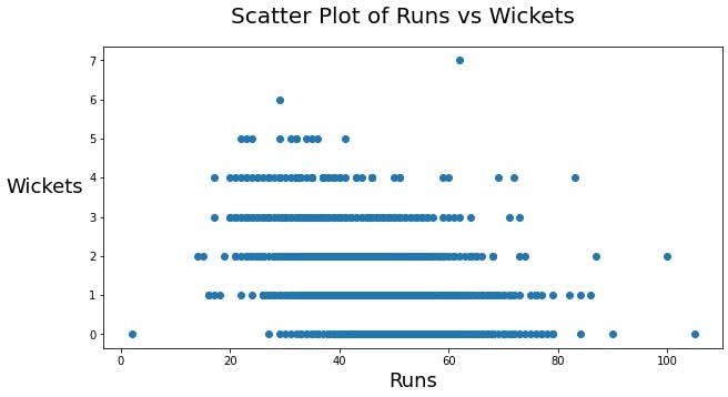
Clearly, the more wickets a team loses the less likely they are to score huge. This could be an important factor in creating models if we can calculate the correlation of these two variables, but I won't be covering that here.
Moving on, let us create a histogram of the frequency of runs scored by a team using plt.hist(). Let us also find the median of this data to know what is the most statistically likely score of a team at the end of 6 overs.
fig, ax = plt.subplots(figsize=(10,5))

x = match_data['total_runs']

plt.hist(x, 50)

plt.axvline(x.median(), color='k', linestyle='dashed', linewidth=1)
plt.text(x.median()*1.05, 130*0.9, 'Median: {:.2f}'.format(x.median()))

fig.suptitle('Frequency Distribution of Runs Scored',fontsize=20)
plt.xlabel('Runs', fontsize=18)
plt.ylabel('Count', fontsize=18,rotation=0,labelpad=40)

plt.show()
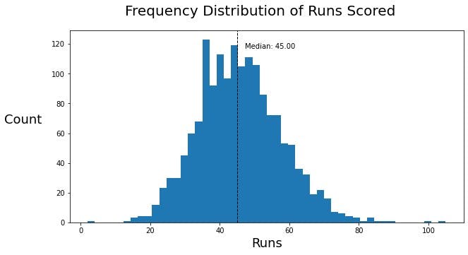
We observe an expected normal distribution here, with a huge spike at around 35. The median of this data is 45, which is the most frequent score at the end of the sixth over in the history of IPL.
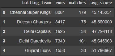
Moving on, let us create a new dataframe to help us calculate the average runs scored by each team in the powerplay. Run df.head() to take a glance at the new dataframe that we just created.
batting_team_data = new.groupby('batting_team').agg(runs = ('total_runs', 'sum'), matches = ('batting_team', 'count'),).reset_index()
batting_team_data['avg_score'] = batting_team_data['runs'] / batting_team_data['matches']

batting_team_data.head()
Let us do a rectangular plot of this data, add the teams and labels of their batting averages in the plot.
fig, ax = plt.subplots(figsize=(10,5))

x = batting_team_data['batting_team']
y = batting_team_data['avg_score']
rects=plt.barh(x, y)
plt.xlim(0,60)

for i, v in enumerate(y):
    ax.text(v+0.5 , i + .25, str(v)[:5], color='black', fontweight='bold',va='top')

fig.suptitle('Average Runs Scored in the Powerplay',fontsize=20)
plt.xlabel('Runs', fontsize=18)
plt.ylabel('Team', fontsize=18,rotation=0,labelpad=40)

plt.show()
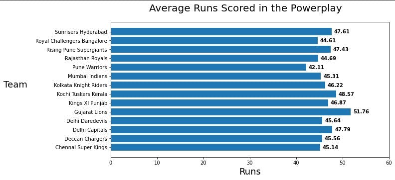
We can clearly see that Gujarat Lions has the highest batting average in the powerplay, so there is a dependency on the team for this as well.
Similarly, let us plot the bowling averages too, to check how much they concede in the powerplay.
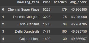
bowling_team_data = new.groupby('bowling_team').agg(runs = ('total_runs', 'sum'), matches = ('bowling_team', 'count'),).reset_index()
bowling_team_data['avg_score'] = bowling_team_data['runs'] / bowling_team_data['matches']

bowling_team_data.head()
In the same way, we would create box plots for each team, and see if there is a consistent difference.
fig, ax = plt.subplots(figsize=(10,5))

x = bowling_team_data['bowling_team']
y = bowling_team_data['avg_score']
rects=plt.barh(x, y)
plt.xlim(0,60)

for i, v in enumerate(y):
    ax.text(v+0.5 , i + .25, str(v)[:5], color='black', fontweight='bold',va='top')

fig.suptitle('Average Runs Conceded in the Powerplay',fontsize=20)
plt.xlabel('Runs', fontsize=18)
plt.ylabel('Team', fontsize=18,rotation=0,labelpad=40)

plt.show()
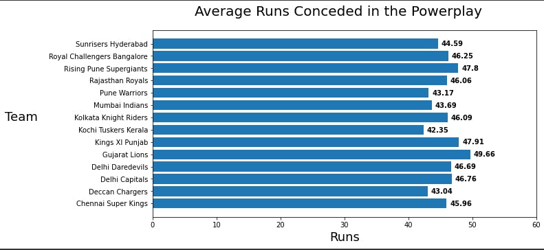
We notice that Kochi Tuskers Kerala has the best bowling average (the lower, the better) amongst all the 13 teams in the dataset.
You can also do similar plotting of wickets lost/taken by each team, but that is not relevant to this contest. Apart from this, you can also check the batting averages of teams on a ground to see if some grounds favour batsmen or not.
This series would end here, so thank you for reaching this far. I am not covering any machine learning models or techniques for the dataset as of now. This is simply a series of blogs for me and for others to go back to the basics when they want to and to play with any dataset as they like.
That's it folks! Stay safe, stay indoors.